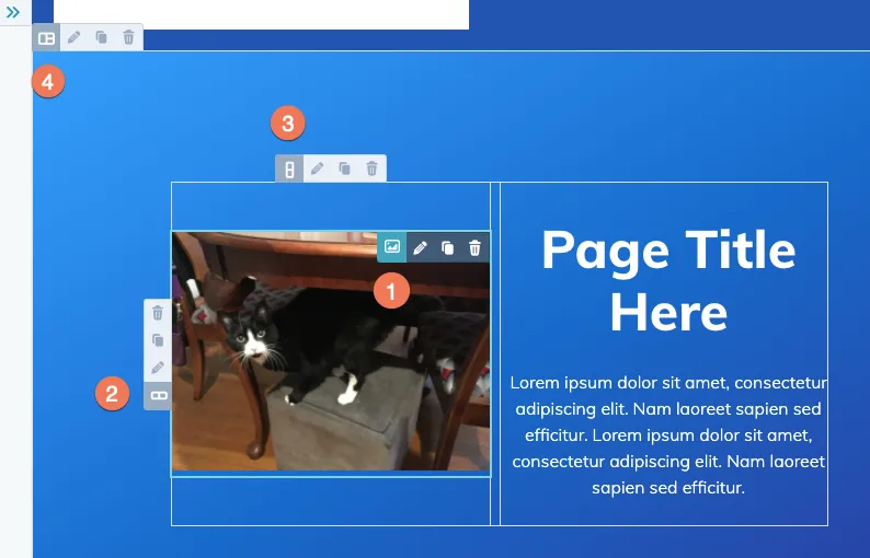
Change the gutter size on HubSpot's drag-n-drop grid
The default 12-column grid system provided by HubSpot for the drag-and-drop page editor is based off outdated CSS rules that are a huge pain to change without breaking things.
Instead of trying to work inside the old way of doing things with floats and complicated calculations to create columns and the space between columns—let’s rewrite them from scratch with modern properties.
There are two ways you could write the new grid system: either using Flexbox or CSS Grid. Recently, I created a replacement in a project using Flexbox just because it has broader overall support in older browsers but either option makes changing the gutter extremely simple thanks to the gap property that now has broad support in browsers.
The Flexbox HubSpot Grid Styles
.row-fluid {
  display: flex;
  gap: 0.5rem;
}
.row-fluid [class*="span"] {
  flex: 1;
}
.row-fluid .span12 {
  flex-basis: 100%;
}
.row-fluid .span11 {
  flex-basis: 91.66%;
}
.row-fluid .span10 {
  flex-basis: 83.33%;
}
.row-fluid .span9 {
  flex-basis: 75%;
}
.row-fluid .span8 {
  flex-basis: 66.66%;
}
.row-fluid .span7 {
  flex-basis: 58.33%;
}
.row-fluid .span6 {
  flex-basis: 50%;
}
.row-fluid .span5 {
  flex-basis: 41.66%;
}
.row-fluid .span4 {
  flex-basis: 33.33%;
}
.row-fluid .span3 {
  flex-basis: 25%;
}
.row-fluid .span2 {
  flex-basis: 16.66%;
}
.row-fluid .span1 {
  flex-basis: 8.33%;
}
@media (max-width: 767px) {
  .row-fluid {
    display: block;
  }
}
This is basically 1-to-1 with the original HubSpot layout.css file but instead of using margin and width for the gutter and column sizing we are using gap and flex-basis which means you can now change the gutter without having to re-calculate all the percentages in every single class—hallelujah!
The CSS Grid HubSpot Grid Styles
If you prefer the newer CSS Grid syntax (or just don’t need support for IE) here’s how you’d do it:
.row-fluid {
  display: grid;
  grid-template-columns: repeat(12, 1fr);
  gap: 0.5rem;
}
.row-fluid .span12 {
  grid-column: span 12;
}
.row-fluid .span11 {
  grid-column: span 11;
}
.row-fluid .span10 {
  grid-column: span 10;
}
.row-fluid .span9 {
  grid-column: span 9;
}
.row-fluid .span8 {
  grid-column: span 8;
}
.row-fluid .span7 {
  grid-column: span 7;
}
.row-fluid .span6 {
  grid-column: span 6;
}
.row-fluid .span5 {
  grid-column: span 5;
}
.row-fluid .span4 {
  grid-column: span 4;
}
.row-fluid .span3 {
  grid-column: span 3;
}
.row-fluid .span2 {
  grid-column: span 2;
}
.row-fluid .span1 {
  grid-column: span 1;
}
@media (max-width: 767px) {
  .row-fluid {
    display: block;
  }
}
I’m sure HubSpot will eventually update the default boilerplate layout styles to Flexbox or CSS Grid 🤞— I’ve learned that if you bug Jon McLaren enough times, in the HubSpot Developers Slack channel, anything can happen. 😜